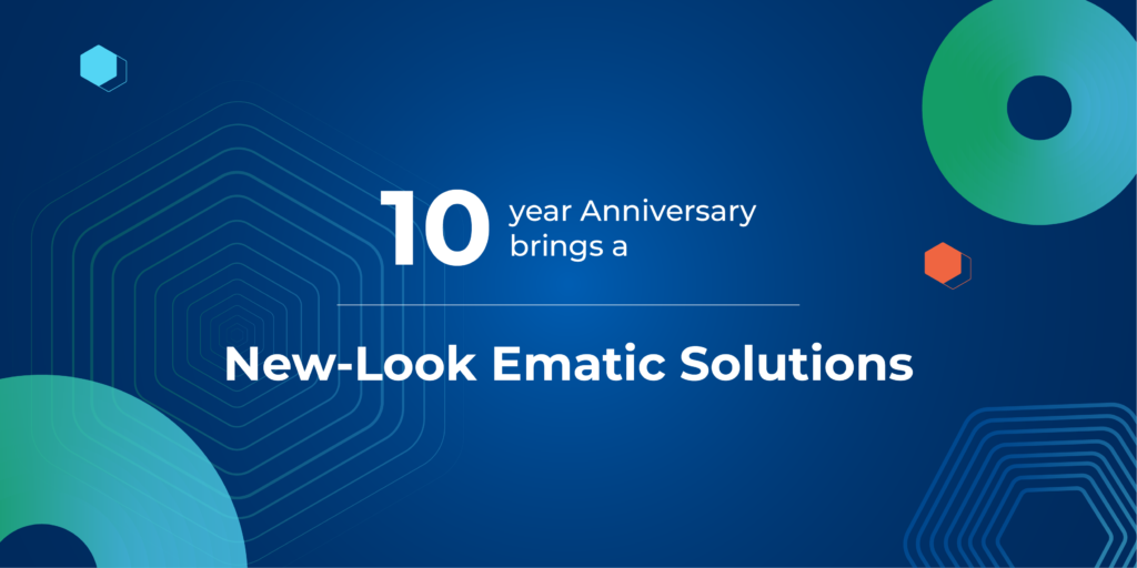
With over 80 ecosystem partners and an established presence in 11 countries, it’s been ten productive and efficient years for Ematic Solutions in the last decade!
Built on the back of a mission to generate real and tangible value for businesses, we take pride in bridging the gap between brands and their customers via the use of marketing technology (or martech). Over the last ten years, the organization has grown and learned much. One of our biggest lessons is that tech alone doesn’t move the needle for our client: their marketing channels must be optimized and connected as well.
Since then, we have expanded our offering to cover the main pillars of digital marketing, from SEO, performance marketing, social media marketing, CRM, e-commerce, analytics, and UIUX to Martech engineering optimization. This has made us capable of solving any problem in the digital ecosystem for our customers. To honor this progress and also in order to better align with our mission and vision as a company, we have undergone a visual rebranding. This is a promising evolution that not only pays homage to our heritage and our progress but also propels us to a brighter future.
Why Rebrand?
In light of our growth as a company, our visual branding no longer accurately reflects what Ematic Solutions encompasses, hence the need for a rebrand.
This visual rebranding serves a twofold purpose: it is primarily a celebration of our success, the journey going there, and the people who have helped build the organization. At the same time, it is a demonstration of our improved capability to provide UI and design solutions.
In an increasingly digitized world (made only even more so due to the conditions of the pandemic), both user interfaces and user experience play critical roles in the success of any digital product, service, or business. It directly impacts how a potential client or consumer perceives and interacts with a business.
Below, we break down the aspects of the rebrand and what the changes mean for the organization.
Color Palette
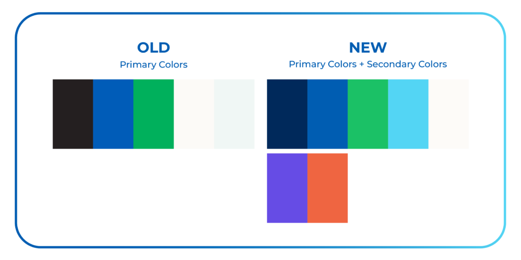
Currently, three primary colors constitute our branding: black, green, and blue, meant to align with our previous identity of being a tech-savvy organization. By introducing light blue as a fourth primary color and orange and purple as secondary complementary colors, we aim to bring more fun and vibrancy to the brand.
To bring a sense of modernness to the brand, the original Ematic blue and green will be given a gradient treatment, allowing these colors to pop more and appear lighter.
Gradient Usage
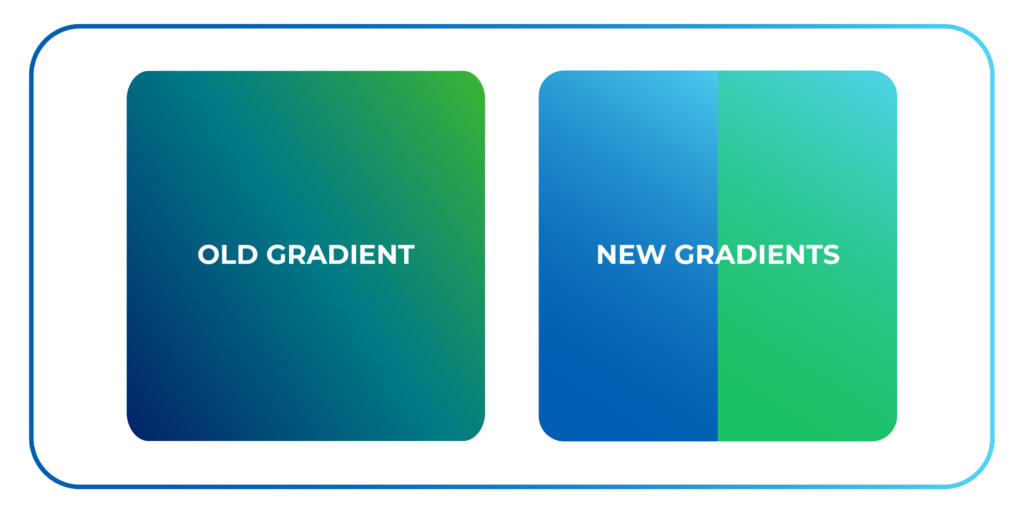
The original Ematic blue and green palette will be used as dominant colors for the gradient usage. The newly added light blue color will complement these darker shades to bring life into the visuals.
Typeface
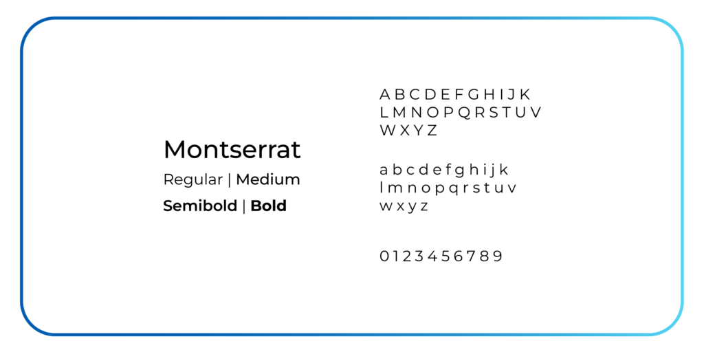
To complement the updated color palette, the current sans serif typeface–Montserrat–will be used exclusively, in four different weights. With a large x-height, short descenders, and a wide aperture, Montserrat makes for an excellent contemporary pick as it is highly legible and flexible for multiple purposes.
Key Elements
![]()
That’s right–even the logo is getting a facelift! To further push the modern design scheme, the Ematic logo of a six-pointed lowercase letter e will be featured as visual patterns to enhance text-heavy visuals.
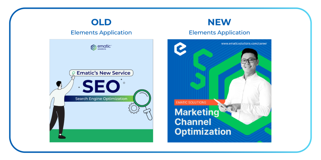
Ematic Solutions is changing how it presents itself by including real people and removing clip art images in visual branding. The aim is to make the brand feel more human and relatable. Ematic Solutions believes its achievements are thanks to its people – experts, consultants, and employees from different backgrounds who collaborate to make the organization successful.
By highlighting our staff, who are very important to us, we want to show that our brand is global, and has grown steadily only with the hard work of hundreds of employees coming together.
What does this design mean for us?
Our last decade as a marketing technology-focused company has taught us much about the space, and our most significant realization is the need for an integrated and holistic approach to marketing.
While technology may take you far, the creativity and marketing expertise to maximize the channels through which marketing efforts flow can truly push marketing technology to the next level.
In order to accurately reflect this two-pronged approach, a rebrand was needed to quickly communicate to potential clients the growth and potential of the new and improved Ematic Solutions.
Our holistic approach allows us not only to deploy marketing technology but to create a digital ecosystem that will allow it to thrive and become an effective tool for the client.
In a way, this rebrand is just a visual catch-up to who we are now, today. We’ve come far from our early beginnings, and with everything we’ve learned along the way, we’ve evolved to provide a comprehensive and holistic suite of services for our clients to enjoy. We know who we are, and we know what we’ve accomplished. We want others to look at our visual branding and know that, too. – CEO of Ematic Solutions, Paul Tenney
Our design powerhouse
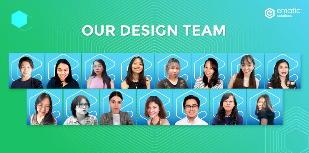
This amazing design change was conducted by our UI/UX team. Our highly skilled team of UI/UX experts, with an eye for detail and a passion for innovation, worked tirelessly to bring about an incredible design transformation that leaves us in awe.
The good news is, their incredible skills and abilities are readily available for you to utilize and benefit from. We’ve launched a new UI/UX service to help you create a website with an aesthetically pleasing and user-friendly interface.
If you’re considering giving your website a fresh new look, take action now and explore our exceptional UI/UX services!”